James is in charge of the relationship between his company and its suppliers. In order to enhance his relationships with some of his suppliers, he decides to separate them into different groups. He distinguishes 4 types of suppliers and defines therefore 4 different categories or suppliers groups:
- Group 1: suppliers for strategic partnerships
- Group 2: promising suppliers that must be supported via supplier development programs
- Group 3: suppliers for competitive partnerships: they have to be considered for competitive partnerships
- Group 4: suppliers to be pruned: they should no longer be considered for the partnership in any levelsuppliers to be pruned.
James decides to evaluate the suppliers on the basis of the following criteria:
- criterion 1: Support in Product Structural Design and Support Process Design and Engineering
- criterion 2: Level of Technology
- criterion 3: Quality Performance
- criterion 4: Financial Strength
- criterion 5: Cost Reduction Performance
- criterion 6: Delivery Performance
- criterion 7: Ease of communication
In order to model his categories or groups and given his criteroia, he decides to define 3 limiting profiles which have the aim to define a frontier or a boundary between the groups. The evaluations of these profiles are given here below:
For more information about the profiles parameters go to: group definition profiles.

After discussion, James has been able to give some preference parameters (the weights, the thresholds, etc.). For more information about the preference parameters go to: Preference parameters;
James' preference parameters:

Suppliers to be evaluated:

Graphical Illustration:
Representation of solely the profiles on the left whereas supplier 2 is compared to those profiles on the right. Let us remark that the profiles verify the condition of dominance.
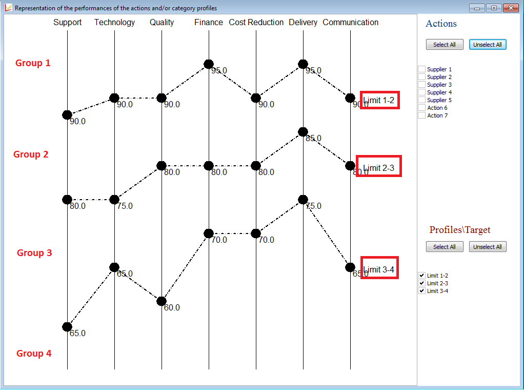 |
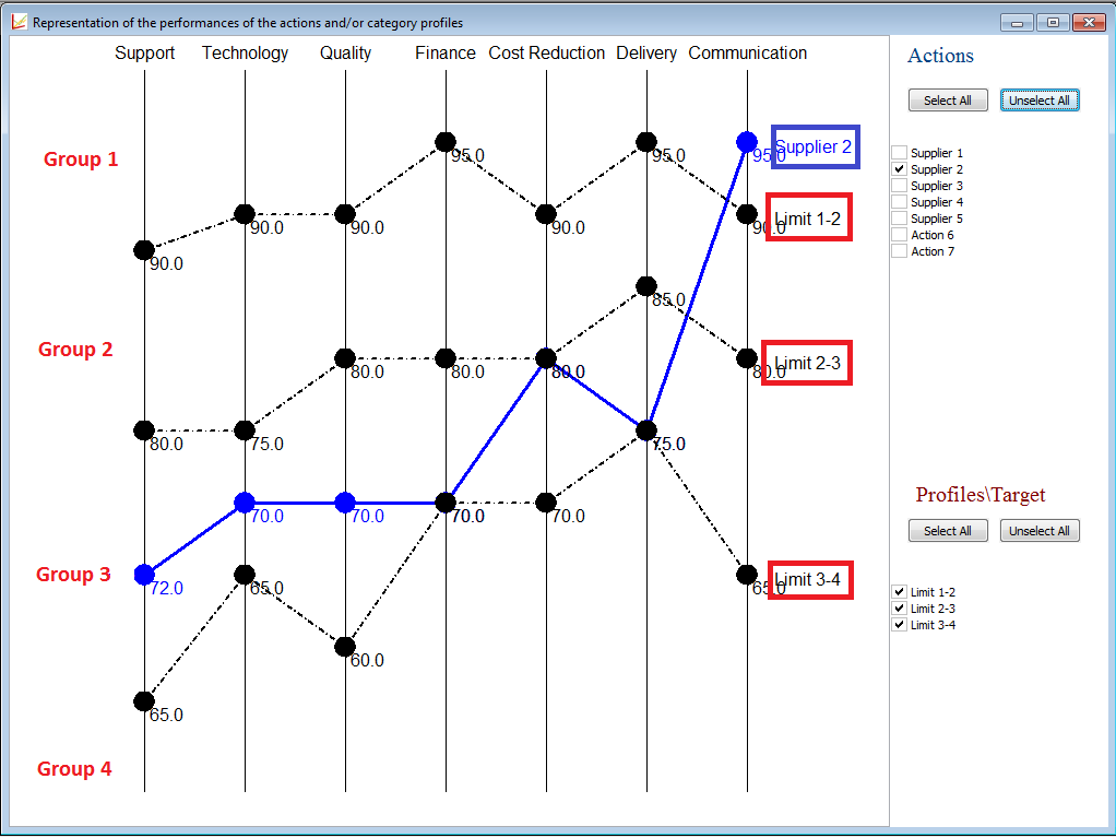 |
James is now interested in his results. His has different tools to analyse his results.... He can use:
- the shortcuts of the toolbar (displayed left), or
- the ranking tools from the toolbar...(displayed right)
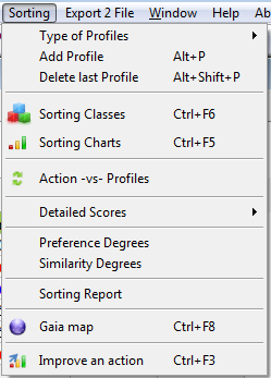 |
|
Let us now analyse every possible result.
1.
Using the
tool  or clicking CTRL+F5 or
going to the
Menu Bar --> Sorting --> Sorting Classes
Display:
 |
 |
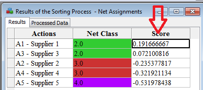 |
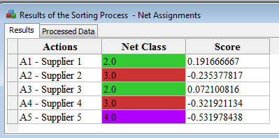
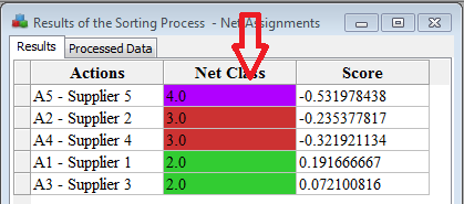
This figure displays the groups and the scores of the five suppliers compared to the limiting profiles. By right-clicking with the mouse on the top of the Net Class column, you can order the actions in increasing order whereas when right-clicking on the Score column in decreasing order.
We can conclude that "Supplier 1" and "Supplier 3" are both assigned to a high group (group 2 - green group) but that no supplier belongs to the best group (group 1). Moreover, from the scores we can conclude that Supplier-1 is the best whereas Supplier 5 the worst.
2.
Using the
tool  or clicking CTRL+F6
or going to
the
Menu Bar --> Sorting --> Sorting Charts
Display:
 |
 By clicking right on the chart graph or by clicking on the Paramter button:  |
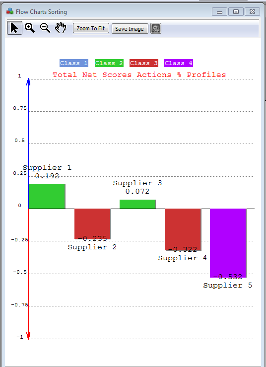
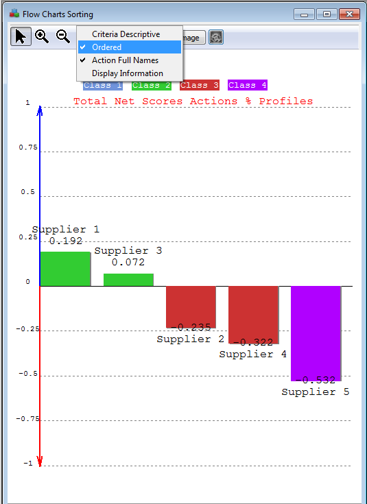
So this figure, displays the scores of all the actions. The actions with a global positive score (i.e. a positive net score), are displyaed with a rectangle oriented to the top and with a negative bottom-down oriented. The colour of the rectangles corresponds to the groups. This figure might be saved easily in any picture format (.png, .bmp, .giff) and some other features are displayed on the right: criteria descriptive, ordered, display information.
You can change the display of the previous graph and represent the actions in increasing rank: Ordered graph.
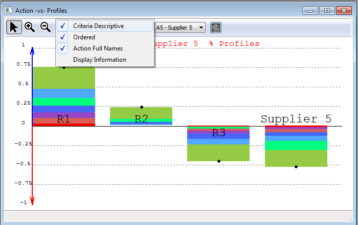
When selecting the Criteria Descriptive view, the following graph is displayed:
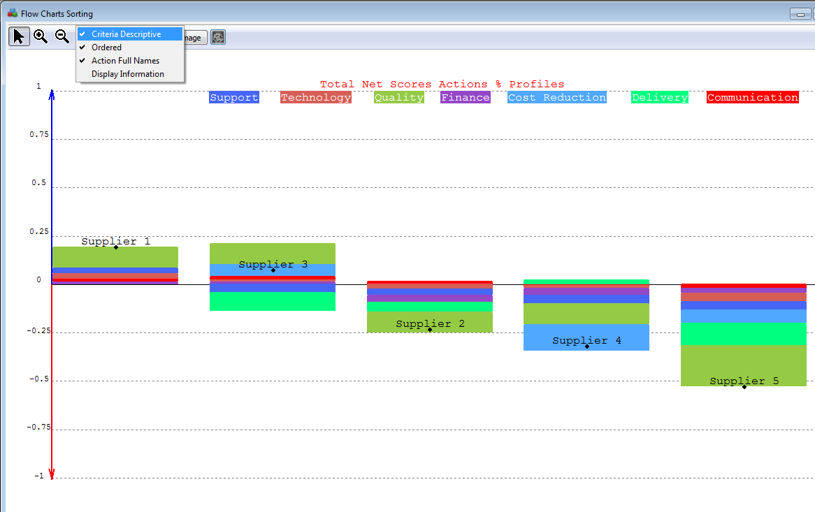 |
The left figure, displays the contribution of each criterion for each action to the final score. For instance, we know that the Supplier 1 has a score of 0.192. This score is coming from a good performance on the criteria Quality, Support and in a smaller manner Technology. Supplier 3, although good performances on Quality and Cost Reduction, has bad performances on Delivery and and Support. The net score for Supplier 3 is given by the black bullet, and is about 0.1.
Supplier 5 has nothing in the upper part or above the horinzontal line, this means thus that compared to the profiles, it behaves badly on all the criteria. This explains thus the very low score (-0.532).
By moving the mouse over the graph, you will have access to detailed - value information.
3.
The GAIA
MAP: Click on the tool  or CTRL+F8or going to the
Menu Bar --> Ranking --> GAIA MAP
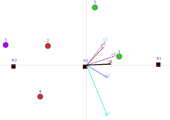
For the problem described in previous sections, the GAIA Map will look as follows:
 |
The map displayed on the
left is called the GAIA map
and represents the decision problem. It permits thus
to
discover quickly the
weaknesses and strengths of all the actions in one plane, and thus to
compare them. Moreover, it permits to discover quickly and easily
similarities between actions... - The bullets represent the actions or the suppliers to be regrouped together (Supplier 1, etc.) - The coloured arrows represent the criteria/features describing the suppliers (quality, support, etc.) - The black arrow D, also called the decision stick, represents the direction of the compromise of the decision maker. Its position depends on the weigths given to the criteria.... It represent thus the decision.... look at the figure here below if the weight of power is 95%... How to understand this map ? - The position of the actions/bullets gives you information about their similarity/dissimilarity. For instance, Supplier.1 and Supplier.2. are not close to each other on the plane --> their performances are very different --> they are quite dissimilar with some small similiaraities though. - If an action lies in the direction of a criterion (arrow), it means that it behaves very well on that criterion. For instance, Supplier 1 is very good cars considering c4 and c3. However, if the actions are in an opposite direction of a criterion, they are weak on that criterion. For instance, Supplier 1 is not very good on c6. - The relative position of the criteria tell us which criteria are correlated and which are conflicting. Close criteria, i.e., wich are pointing in the same direction are correlated, whereas criteria pointing in oppposite directions, are conflicting: a supplier can not have a good evaluation on the cost reduction (criterion c5 - light blue) and being good on support (criterion c1-blue) and delivery (c6-light green) according to the data. Technology (criterion c2) can not be excellent when reducing the Cost (light blue). The comfort can not be great if the car is very powerful. But the Finance and the Quality are on the other hand correlated... according to the given data although ! Let us remark that when representing this map, some information is lost (due to the projection when going from n-dimensions to 2 dimensions). The quality of the map is given by the Delta-value (here 89% which is a good value). For more information, read A little bit deeper into FS-GAIA. |
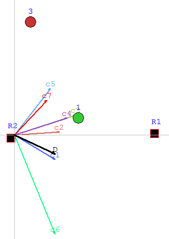 |
Gaia map of the same
problem but in this case, the
weight of Support criterion is
95%. The Decision stick is very very very close to the power criterion.
The GAIA map depends thus on the preference parameters.... |
When clicking right on the map or when clicking in the Parameters button, you can access to the features of this map: projections, legends, performances and weigths.

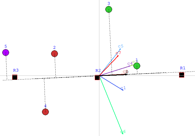
When clicking on the projections the following graphs may appear:
 |
 |
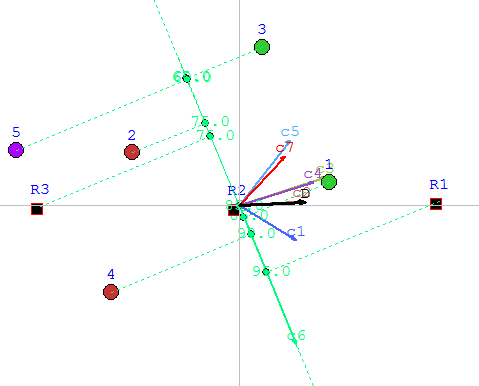 |
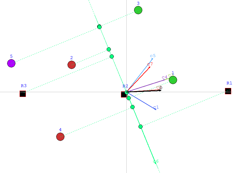
The left figure represents the GAIA MAP with projections on the Decision Stick. We can thus see, that Supplier 1 is in the same direction as the stick. From this projections, we see thus that Supplier 1 is the best. whereas Supplier 5 is the wost one. Supplier 5 is in the complete opposite direction, close to the last and worst profile. Between those two extreme,we can find the other suppliers.
By clicking left on the Delivery - green arrow, we have now the projections on the Delivery criterion. We can easily deduce fron this view that Supplier is not the best on this criterion. Supplier 4 behaves very well on this criterion since its projection (green bullet) is close to the best profile. This is confirmed in the Descriptive score view where Supplier 4 is the only supplier with a positve score for Delivery. By choosing Performances (in the display parameters) you can display, the actual values of the performances of the auppliers. We are now remembered that the delivery of Supplier 5 is 60.
A little bit deeper into the FSGAIA plane....
[if supportFields]> REF
_Ref266789151 \h The left figure[if gte mso 9]> An
FS-GAIA
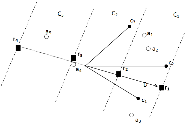
plane, such as in the left figure[if gte mso 9]> For
instance, in the left figure, the criteria c1
and c2 are close to each other which means that they discriminate the
actions
in the same manner (they are thus correlated). On the other hand, c1
and c3 are
not
close: they are conflicting. If an
action is indifferent to a reference profile it will indeed have the
same
position as the reference profile
in the FS-GAIA Plane. Although two
actions
may be assigned to the same category, they can behave in a different
way. These
are so-called incomparable actions: they lay in a same stripe but are
distant.
![]() [if gte vml 1]>
[if gte vml 1]>
The
figure below
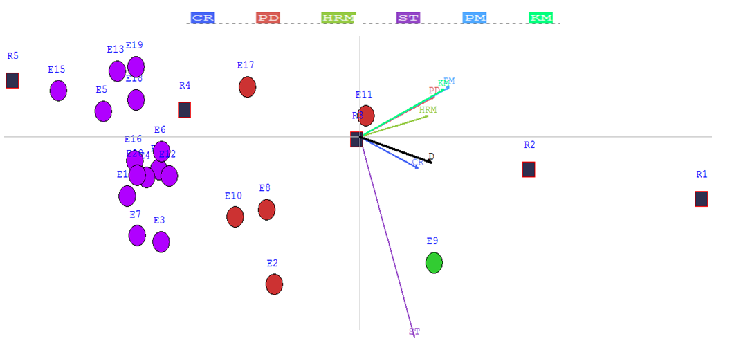
represents the FS-GAIA plane of the 20 SMEs or actions compared
to the limiting profiles. E9
and E11 behave in a ranking context
similarly when compared to the rest of the SMEs but
differently when compared to solely the
limiting profiles.
In the
sorting
context, there exist a main difference between E11 and
E9 on the criterion Strategy. This is indicated in the FS-GAIA plane by
the
fact that
E11 is in the opposite direction as the criterion axis, on
the
contrary of E9. E9 is very
far
away from the limiting profiles R2 and R3 which means that it behaves
differently on the different criteria. We can see that E9 performs much
better
on the criterion strategy than on the other criteria.
The FS-GAIA plane can detect heterogeneity
within classes of actions: class 3 and 4 may be further
subdivided.
4. Unicriterion or Criterion Net Flows:
In the Menu Bar --> Sorting --> Detailed Scores --> Unicriterion Net Flows:
 The
scores of the actions on the different criteria are thus given. You
can order the results, by right clicking on the head of the column.
Indeed, these values can be exported to excel by copying-pasting from
the table. The
scores of the actions on the different criteria are thus given. You
can order the results, by right clicking on the head of the column.
Indeed, these values can be exported to excel by copying-pasting from
the table. |
 |
5. Detailed Scores
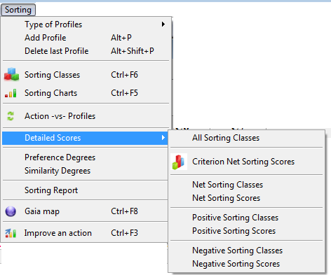
a. Net scores of the actions and of the suppliers.
In the Menu Bar --> Sorting --> Detailed Scores --> Net Sorting Scores.In the Menu Bar --> Sorting --> Detailed Scores --> Net Sorting Classes.
In the following table you find the net scores of an action/supplier as well as the scores of the profiles compared to each action individually.
So, e.g., Supplier 1 has a score of 0.19166 whereas the first limiting profile 0.522, the second limiting profile -0.0029 and the third limiting profile -0.7111.

For more information about this score, read also: 'An action compared to the reference profiles.
b. Positive scores of the actions and of the suppliers.
In the Menu Bar --> Sorting --> Detailed Scores --> Pos Sorting Scores.
In the Menu Bar --> Sorting --> Detailed Scores --> Pos Sorting Classes.
The positive score of an action measures how this action outperforms the other on all the criteria. So, it will be computed by looking how good it is compared to the others.
In the following table you find the positive scores of an action/supplier as well as the scores of the profiles compared to each action individually.
So, e.g., Supplier 1 has a score of 0.2917 whereas the first limiting profile 0.522, the second limiting profile 0.1729 and the third limiting profile 0.

For more information about this score, read also: 'An action compared to the reference profiles.
b. Neg scores of the actions and of the suppliers.
In the Menu Bar --> Sorting --> Detailed Scores --> Neg Sorting Scores.
In the Menu Bar --> Sorting --> Detailed Scores --> Neg Sorting Classes.
The negative score of an action measures how this action outperforms the other on all the criteria. So, it will be computed by looking how bad it is compared to the others.
In the following table you find the negative scores of an action/supplier as well as the scores of the profiles compared to each action individually.
So, e.g., Supplier 1 has a score of 0.07755 whereas the first limiting profile 0, the second limiting profile 0.175 and the third limiting profile 0.07755.

For more information about this score, read also: 'An action compared to the reference profiles.
6. Sorting Report: Menu Bar: Sorting --> Sorting Report
In the sorting menu, you will find the Sorting report feature which permits you to display a small report of the sorting results.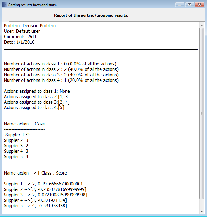
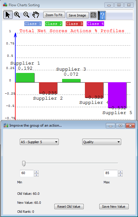
7. Performance sensitivity/analysis or improvement of the group assignment of an action: CTRL+F3
In the Menu Bar --> Ranking -->Improve an action or click on CTRL+F3
 |
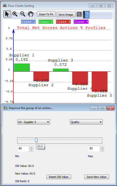 |
In the left figure, we can notice that action Supplier-5 is assigned to the last group (purple colour) from the charts' graph. So, the purpose of the 'Improve the group of an action' is to give the possibility to change the performance of an action (choose in the list left) on a particular criterion (choose in the list right) with a slider between two values. This permits, combined with the sorting charts, to discover when an action will be assigned to a better or worser group. In the example, we can notice that as soon as Supplier-5 gets a Quality of 65, it is assigned to Group 3; it wins thus a category.
The decision maker can change the values (e.g., 60 and 85) which by default are the minimum and maximum values of the actions on the chosen criterion.
You can always save the new value or come back to the old value.
8. Action compared to a profile.
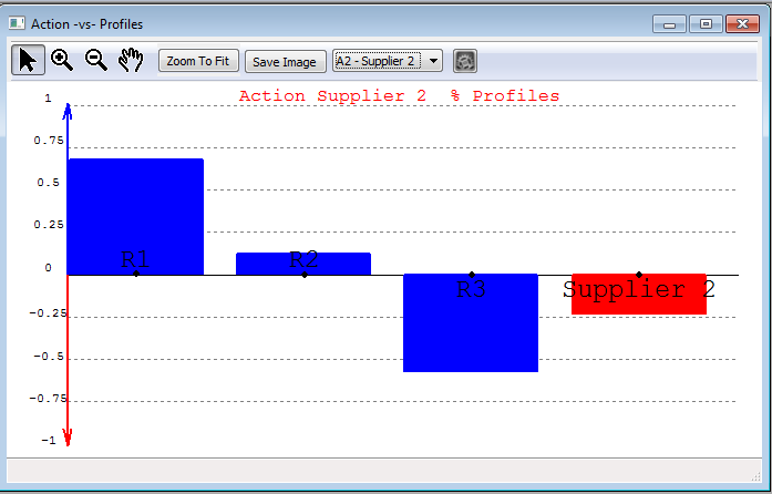
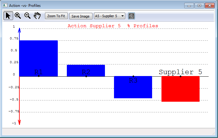
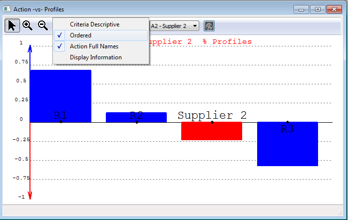
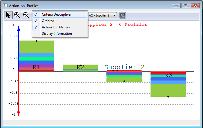
The scores represented in 'Groups and scores of the actions compared to the profiles' are the result of a comparison of the actions to the profiles individually and separately. From the figure 'Groups and scores of the actions compared to the profiles' we can remark that the score of Supplier-2 is -0.235.This can be explained as follows: if we rank the Supplier-2 compared to solely to the reference profiles, we obtain the graph displayed on the left. If we order this graph (left middle figure) we see that Supplier 2 is between R2 and R3 --> Group 3.
Supplier 5, when compared to the profiles, is the worst --> Group 4. The last figures (bottom) explains the scores and give the contributions on all the criteria. Supplier 2 performs better on the red and braun criteria than R3 and its highest weak performance is on quality - though still better than R3. Supplier 5 performs very bad on that criterion, even worse than R3. Moreover, Supplier 5 performs even worse on the light green criterion: delivery than all the other profiles and performs on average as bad as profile R3... this explains easily why Supplier 5 is assigned to group 4 and Supplier 2 to group 3.
 |
 |
 |
 |
 |
 |

