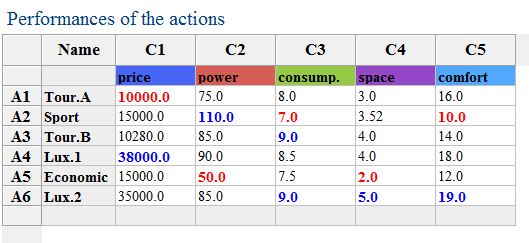
James would like to buy a new car, but he has no idea which car to choose. His car retailer proposes James to help him, and shows him therefore 6 different cars whose evaluations are given in the Table below. After discussion, James has been able to give some preference parameters (the weights, the thresholds, etc.).
For more information about the preference parameters go to: Preference parameters
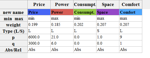
James' preference parameters:
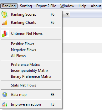
James is now interested in his results. His has different tools to analyse his results.... He can use:
- the shortcuts of the toolbar (displayed left), or
- the ranking tools from the toolbar...(displayed right)
|
|
Let us now analyse every possible result.
1.
Using the tool  or
clicking F6 or
going to the
Menu Bar --> Ranking --> Ranking
Display:
 |
 |
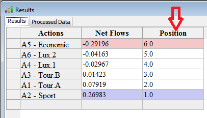 |
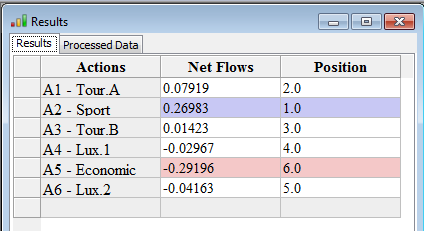
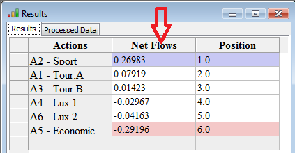
This figure displays the scores and the ranks for all the cars according to the preference parameters. By right-clicking with the mouse on the top of the Net Flows column, you can order the actions in increasing order whereas when right-clicking on the Position column in decreasing order.
We can conclude that "Action 2 - Sport" is James' best car with a score of 0.26983, followed by "Action 1 - Tour. A" with a score of 0.07919.
2.
Using the tool  or
clicking F5
or going to the
Menu Bar --> Ranking --> Ranking Charts
or
clicking F5
or going to the
Menu Bar --> Ranking --> Ranking Charts
Display:
 |
 By clicking right on the chart graph or by clicking on the Paramter button:  |
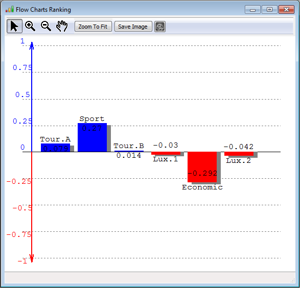
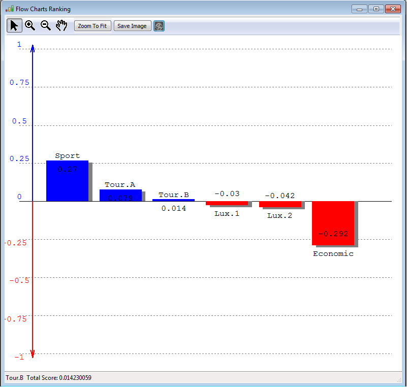
So this figure, displays the scores of all the actions. The actions with a global positive score (i.e. a positive net score), are displyaed in blue whereas the actions with a negative score are displayed in red. This figure might be saved easily in any picture format (.png, .bmp, .giff) and some other features are displayed on the right: criteria descriptive, ordered, thermometer view.
You can change the display of the previous graph and represent the actions in increasing rank: Ordered graph.
When selecting the Criteria Descriptive view, the following graph is displayed:
 |
  |
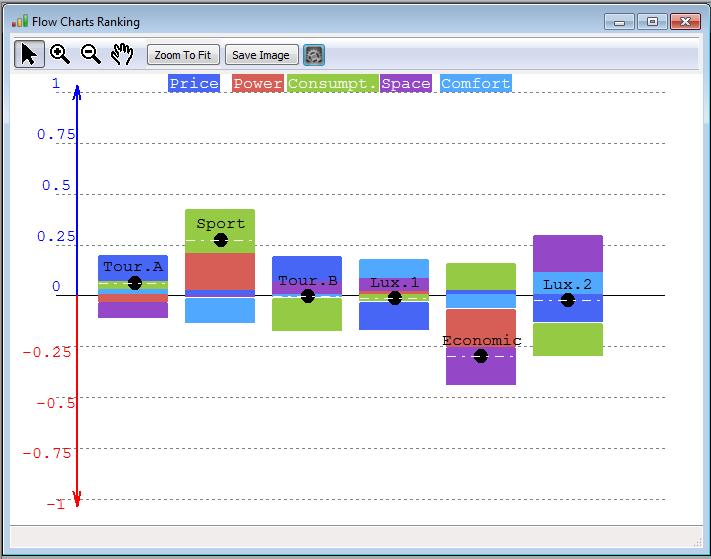
The left figure, displays the contribution of each criterion for each action to the final score. For instance, we know that the Sport car has a score of 0.27. This score is coming from a good performance on the criteria consumption, power and in a smaller manner price. Yes, a good performance on the consumption criteria.... check the data in Fig. . (Do not forget this is not real data :-)). However, the Sport car doesn't seem to perform well the comfort criterion.... this is indicated by the negative contribution (the light blue is in the negative part). Compensating the good poins by the weakness leads to a score of 0.27, represented by the black bullet and doted white line. If we consider Lux 2 car, we can see that it performs very well on comfort and space, but is very weak on the price and on the consumption.
So this graph permits us to understand the origin of the final score ; i.e. the contributions on each criterion.
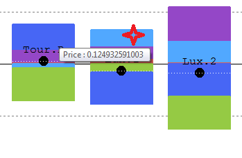
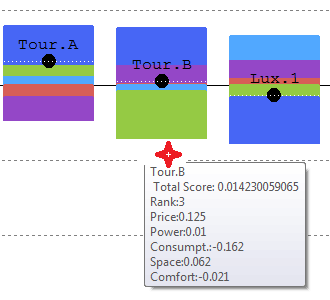
By moving the mouse over the graph (red cross on the right figures), you will have access to detailed - value information.
When selecting the Thermometer view, the following graph is displayed:
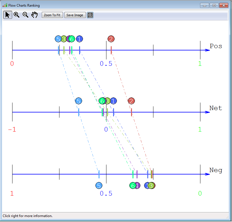 |
The upper line displays
a ranking of the actions
according to their
strong performances, i.e.
based on the positive flows.
The
higher this score, the better. The lower line displays a ranking of the actions according to their weaknesses. This is traduced by the negative flows. The lower their weakness the better it is... The middle line displays the average of the negative and positive flows: the net flows which is obtained as follows: the positive - negative flows. So we can see for instance that - car 1 has strong performances compared to the other cars (--> 2nd position on the positive scores) but car 1 has also certain weaknesses (3rd position on the negative scores)... but globally, it is the second position - car 3 doesn't have much strong weaknesses... (see negative ranking) but doesn't have strong points (see positive flows) --> average car: 3rd position. - car 6 has lots of weaknesses and relatively some good performances too.... on average 5th position. |
3.
The GAIA MAP: Click on the tool  or F8or going to the
Menu Bar --> Ranking -->
GAIA MAP
For the problem described in previous sections, the GAIA Map will look as follows:
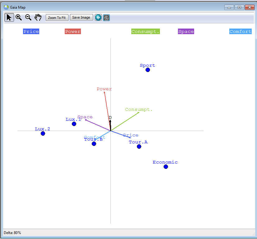 |
The map displayed on the
left is called the GAIA map
and represents the decision problem. It permits thus to
discover quickly the
weaknesses and strengths of all the actions in one plane, and thus to
compare them. Moreover, it
permits to discover quickly and easily
similarities between actions... - The bullets in blue represent the actions or the cars amongst which to choose (Sport, Lux.1, etc. - The coloured arrows represent the criteria/features describing the cars (price, power, etc.) - The black arrow D, also called the decision stick, represents the direction of the compromise of the decision maker. Its position depends on the weigths given to the criteria.... It represent thus the decision.... look at the figure here below if the weight of power is 95%... How to understand this map ? - The position of the actions/bullets gives you information about their similarity/dissimilarity. For instance, Lux.1 and Lux.2. are close to each other on the plane --> their performances are not very different --> they are quite similar with some small differences though. On the other hand, we can see that Sport and Economic are far away from each other --> very different. - If an action lies in the direction of a criterion (arrow), it means that it behaves very well on that criterion. For instance, Tour A and certainly Economic are very goods cars considering their price. However, if the actions are in an opposite direction of a criterion, they are weak on that criterion. For instance, Ecomomic is very weak on the criterion space.... - The relative position of the criteria tell us which criteria are correlated and which are conflicting. Close criteria, i.e., wich are pointing in the same direction are correlated, whereas criteria pointing in oppposite directions, are conflicting: a car can not have a good price (small price) and have lots of space. The comfort can not be great if the car is very powerful. But the space and comfort are on the other hand correlated... Let us remark that when representing this map, some information is lost (due to the projection when going from n-dimensions to 2 dimensions). The quality of the map is given by the Delta-value (here 80% which is a good value). |
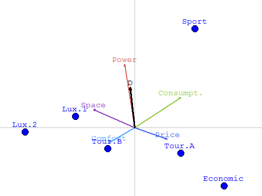 |
Gaia map of the same
problem but in this case, the
weight of power is
95%. The Decision stick is very very very close to the power criterion.
The GAIA map depends thus on the preference parameters.... |
When clicking right on the map or when clicking in the Parameters button, you can access to the features of this map: projections, legends, performances and weigths.

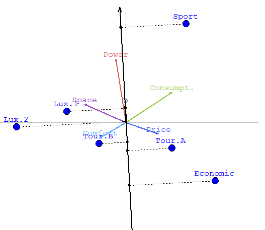
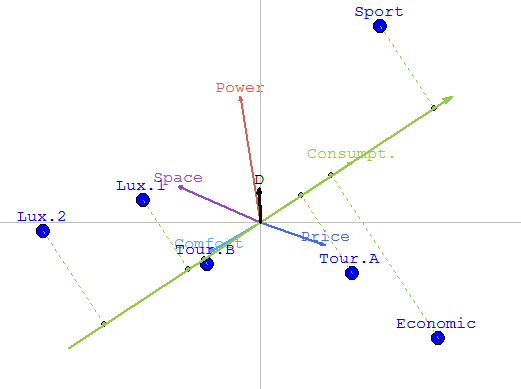
When clicking on the projections the following graphs may appear:
 |
 |
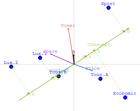 |
The left figure represents the GAIA MAP with projections on the Decision Stick. We can thus see, that Sport is in the same direction as the stick. From this projections, we see thus that Sport is the best. whereas Economic is the wost one. Between those two extreme, the luxuary and touring cars are close to each other.
By clicking left on the Consumption - green arrow, we have now the projections on the Consumption criterion. We can easily deduce fron this view that Sport is the best on this criterion, whereas Lux.1 and Lux.2. are very weak because those two cars consume a lot.By choosing Performances (in the display parameters) you can display, the actual values of the performances of the car. We are now remembered that th consumption of Sport is 7.0 and that fron Lux 2. 9.0
4. Criterion Net Flows:
In the Menu Bar --> Ranking --> Unicriterion Net Flows:
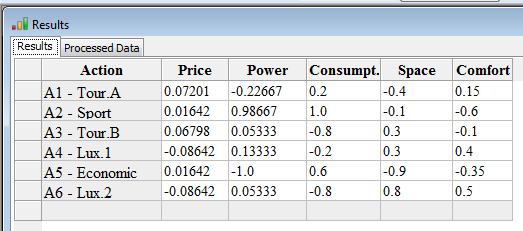 |
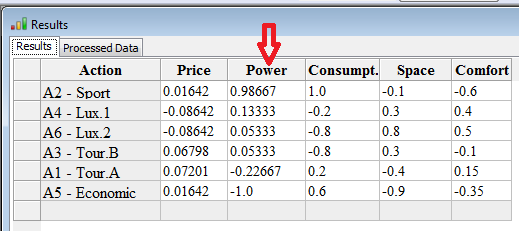 |
The scores of the actions on the different criteria are thus given. You can order the results, by right clicking on the head of the column. Indeed, these values can be exported to excel by copying-pasting from the table.
5. All flows: the positive, negative and net flows...
In the Menu Bar --> Ranking -->All flows:
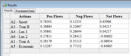
6. In the Menu Bar --> Ranking -->Preference matrix and Menu Bar --> Ranking -->Binary Preference matrix
 |
 |
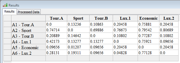
The preference matrix is a matrix which contains the preference degrees between two actions. We might see in the figure below that the decision maker, according to his preferences, prefers A2-Sport to Tour A with a strength of 0.74714 and Tour A to Sport with only 0.1326. The preference degrees are values between 0 and 1, 0 means no preference at all.... 1 a strong preference.
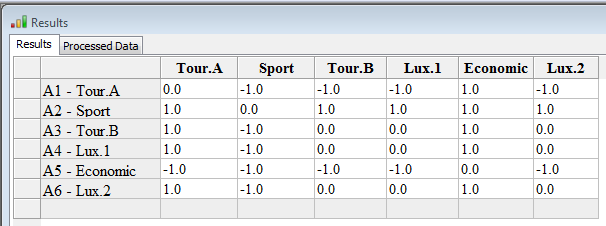
On the right, you can find the binary decision matrix.
If the preference degree of a over b minus the preference degree of b over a is higher then 0.05, then we have the value 1.
If the preference degree of a over b minus the preference degree of b over a is lower then If -0.05, then we have the value -1.
If the preference degree of a over b minus the preference degree of b over a is between 0.1 and -0.1, then we have the value 0.
7. Improvement of the ranking of an action or Performance sensitivity/analysis
In the Menu Bar --> Ranking -->Improve an action
 |
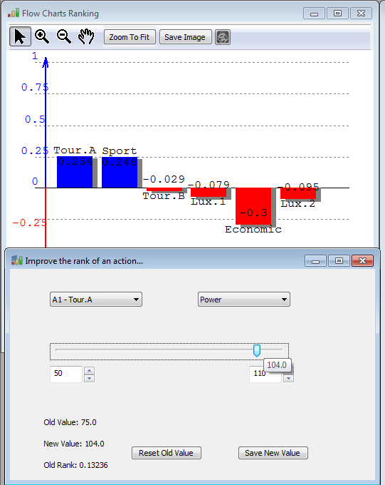 |
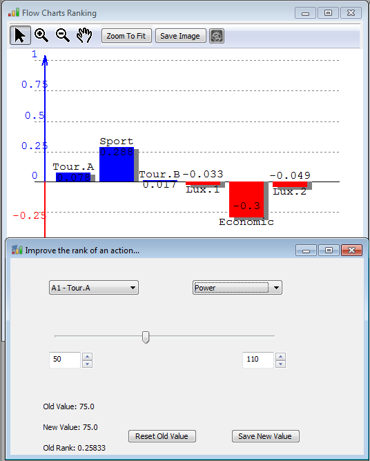
At left, we can notice that action Tour-A is ranked 2nd. So, the purpose of the 'Improve the rank of an action' is to give the possibility to change the performance of an action (choose in the list left) on a criterion (choose in the list right) with a slider between two values. This permits, combined with the ranking charts, to discover when an action will be better ranked, and maybe become the best. In the example, we can notice that as soon as A1-Tour A gets a power of 104, it becomes the best car.
The decision maker can change the values (e.g., 50 and 110) which by default are the minimum and maximum values of the actions on the chosen criterion.
You can always save the new value or come back to the old value.
